jimmy eat world
Valentine’s Day Mix
Steel Train – I Feel Weird
The Postal Service – We Will Become Silhouettes
Rivers Cuomo – Lover in the Snow
Elliott Smith – Say Yes
Jimmy Eat World – Invented
The Smiths – There Is A Light That Never Goes Out
The Dangerous Summer – Reach For The Sun
Wilco – I’m Always In Love
Limbeck – I Wrote This Down
Girls – Saying I Love You
Cults – You Know What I Mean
The Format – Janet
Best Coast – Crazy For You
Tokyo Police Club Cover Jimmy Eat World
Tokyo Police Club finished the second of ten 10-hour long studio sessions yesterday, recording a electric-infused cover of Jimmy Eat World‘s pop-punk hit “Sweetness”. Joined by Michael Angelakos of Passion Pit, the Ontario indie rock outfit don’t really make too many changes to the song aside from a brief electro interlude near the end. You can check out “Sweetness” below.
For the next part of the ten-song series, the band will be recording a cover of “Under Control” by The Strokes.
Jimmy Eat World To Play ‘Bleed American’ In Its Entirety
Ten years ago, Arizona alternative rock band Jimmy Eat World released their critically-acclaimed Bleed American. To celebrate, the band has decided to perform the album in its entirety on September 29th at the Wiltern Theatre in Los Angeles. Pre-sale tickets will be available on July 28th, with the public sale beginning on the 30th.
When the band decided to play both Bleed American and Clarity back to back at London’s Forum, the band sold out both shows – a feat not entirely surprising for a forefront of the emo and alt-rock movements. Their latest album, 2010’s Invented, was rated highly (read our review here) and was just 500 sales shy of becoming the band’s third album to debut in the top ten.
You can check out more of Jimmy Eat World’s 2011 tour dates below.
12 Good Looking Album Artworks (Post-2000)
Album artwork made its first appearance in 1938, when Alex Steinweiss introduced artwork over the previously, plainly labeled covers. This “invention” provided every album with its own unique identity and images that fans could associate their music with. When we think of an album, the first thing that often comes to mind is the cover; it’s become a peripheral of music that no album, EP, or single can do without, remaining with us even in the digital format.
The following twelve album artworks are not ranked in any particular order.
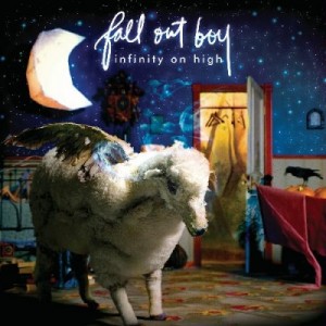
Fall Out Boy – Infinity On High
The flying sheep and dream-like atmosphere are this cover’s best features. The artwork has depth and gives you plenty to look at, especially the various contrasts that coexist (moon/wall and crow/wall with light and dark values, closet interior/wall with temperature values). The artwork just has a unique dream feel.
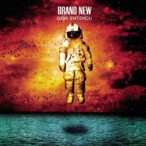
Brand New – Deja Entendu
I have no idea why the astronaut is there, but this cover just looks, to put it simply, cool. Contrasting temperatures result in an odd feel that absolutely fits Brand New’s distinct rock sound. This feel is further expressed by the textures of the water and sky.
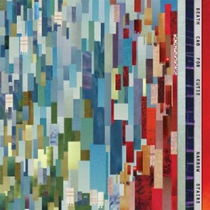
Death Cab For Cutie – Narrow Stairs
No stairs here to reflect the album title, but the cover looks fantastic nonetheless. The multi-hued red, green and blue colored strips of paper being layered have great visual texture and the fact that no two strips share the same tone (more or less) gives this cover a lot of interest.
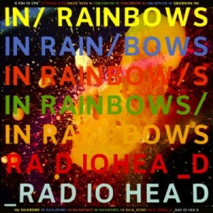
Radiohead – In Rainbows
This pop art styled cover designed by Stanley Donwood, who has done every Radiohead artwork since 1994, looks like something created digitally when in fact it (surprisingly) isn’t. It features a galaxy photograph layered with paint and interesting type that looks simple and fits Radiohead’s style of experimental music. The variety of color also serves to reflect the album title itself.
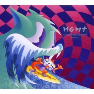
MGMT – Congratulations
‘Psychedelic’ just about sums up this cover. Odd colors, an i-don’t-know-what’s-going-on scene, and the cartoony style makes the cover seem like it’s something you’d see in a weird dream or trip (drugs are bad for you, kids).
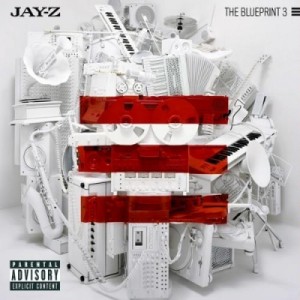
Jay-Z – The Blueprint 3
Clean cover, with something other than the generic rapper’s face or body photograph. From a distance, the red bars have strong dominance and clearly indicate the cover is of the 3rd installation of Jay-Z’s ‘Blueprint’ records. Closer up you notice the objects piled up which adds complexity and depth.
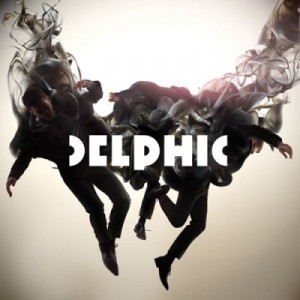
Delphic – Acolyte
The artwork is absolutely amazing. Great photo-manipulation of the band members and the smoke they fade into. It’s something you definitely won’t mind looking at on your ipod.The background may be a tad simple when the complex photomanip is placed on top, but the Delphic typeface works to ease the combination.
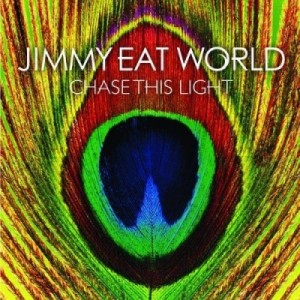
Jimmy Eat World – Chase This Light
Beautiful photograph with vibrant colors, giving insight to what the music itself is like. Nothing really much to say, just a wonderful looking cover.
The Killers – Hot Fuss
Smoooth. A soft blue dominates the cover (plus hints of red), and gives off a fuzzy, mellow feel. The Killers’ logo typeface fits well too, although I’m not sure I can say the same for the buildings lining the bottom…
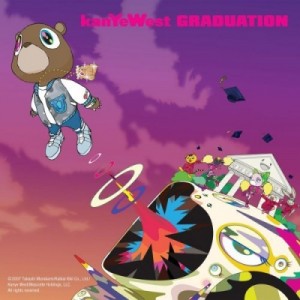
Kanye West – Graduation
The cartoon style of this artwork by Takashi Murakami is great and the colors are extremely eye-catching. The illustration features West in a teddy-bear form (known as “Dropout Bear”, referencing an earlier record) being shot out of a colorful, vectorized who-knows-what. This is one creative rap album cover that sets it apart from nearly every other.
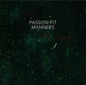
Passion Pit – Manners
Green paint, white text. What else do you really need?
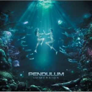
Pendulum – Immersion
The feel of this cover is great. This artwork by Polish artist Valp is mysterious and just seems to fit the sound of Immersion. The colors are great, using a majority of cool green and blue while adding hints of warmer purple and red to increase interest. There is just so much going on here that some may not notice all the subtle elements of the art from a quick glance or from their music player screens.
Jimmy Eat World On Conan
Read more to watch Jimmy Eat World perform “Coffee and Cigarettes” on Conan.
Free Autographed Jimmy Eat World
Visit one of these record stores for a chance to win a free autographed copy of the My Best Theory/Stop 7″ split from Jimmy Eat World. You can also read my review of Invented here.
Five Dollar Jimmy
Jimmy Eat World‘s new record Invented will be on sale for $5 for the month of November. Read the band’s (short) blog post here for an Amazon link. You can also check out my review of Invented here.
Jimmy Eat Superchunk
Listen to Jimmy Eat World cover Superchunk‘s “Precision Auto” on their Purevolume.
Review: Jimmy Eat World – Invented
Jimmy Eat World – Invented
Released: September 28, 2010
Label: Interscope
Purchase: iTunes | Insound | Amazon
There are some things that just don’t change. Every year, fall rolls around, bringing in crisp, chilling breezes, reddening, brittling leaves, and for many, the songs of Jimmy Eat World playing in the background. Whereas some bands may provide the “soundtrack to your summer,” Jimmy Eat World has never been a summer band and they probably never will be. Some things just don’t change.
Or do they?
Jimmy Eat World’s seventh studio album, Invented, pushes the limits of the band’s musical spectrum, while still managing to satisfy their loyal fans. Despite the name, Invented is not an album that brings new ideas and innovation to the table. Rather, the record chooses to “reinvent” the band’s already strong musical roots, adding more and more dimensions.
Overall, Invented is a departure from the dancy, more pop-driven anthems found on Chase This Light. In this respect, the album can be seen as more of a progression from Futures or Clarity, with the same general organization. Invented does include some surprises though.
Opener “Heart Is Hard To Find” is a light, introspective piece that underwhelms on first listen. The song is definitely a grower, though, and its impact seems to increase exponentially each time the track is played. Generally speaking, the entire album follows this pattern, getting better with each successive listen. On the surface, Invented seems lacking, with almost no grandiose sing-along choruses, but deeper down, the album is chockfull of moments of sincerity.
Fifth track “Movielike” is a pivotal turning point for the album, changing the overall atmosphere. “Coffee and Cigarettes” directly follows, highlighting the new harmonies between Jim Adkins and Courtney Marie Andrews, who also provides backing vocals for “Heart Is Hard To Find”, “Movielike”, “Cut”, and “Invented”. (Rachel Haden also provides backing vocals on “Stop”.) “Coffee and Cigarettes” is a fun, addictive track that may indeed be more addictive than its real life counterparts (though having never consumed either, I may not be the best source).
The new vocals, as well as a song sung entirely by guitarist Tom Linton (“Action Needs An Audience”) are the most drastic stylistic differences that separate Invented from the rest of the band’s discography. “Action Needs An Audience” is raw and hits you in the face, a definite nod to the punk roots of the band. But despite these anomalies, every track sticks together as a cohesive unit, guiding you through the experience that is Invented.
And that’s what the album truly is and was meant to be. Invented underwhelms on first listen, but the entire experience keeps you coming back for more. After each listen, something new is discovered – a new gem is spotted, a hidden Easter egg is found. For the first time since Clarity, Jimmy Eat World has returned to the intricately planned sound that develops as you go, providing little instant exhilaration, but still managing to produce stealthily catchy hooks. Invented, in all respects, is the epitome of a “grower.”
The closing line of the album, “You don’t get to walk away, walk away now…It’s too late, you can’t walk away, walk away now” rings in your ears while the dreamy, guitar fades out, leaving you yearning for more. “Mixtape” is a perfect way to close the album and can already be considered one of Jimmy Eat World’s best, matching the caliber of past closers “23” and “Goodbye Sky Harbor”. For all intents and purposes, the closing line speaks the truth. You really can’t walk away from Invented.
While some things may never change, your first impression of Invented will most definitely change after repeated listens. Jimmy Eat World has indeed changed, almost matured in a way, and invites you to step in and be a part of that change.
8.6
Standout Tracks: “Stop”, “Cut”, “Invented”, “Mixtape”
Stream Jimmy Eat World’s Invented Tonight
Jimmy Eat World‘s Invented will be streaming on the band’s MySpace midnight tonight (PST).
Invented will be released September 28, 2010.



Connect