pendulum
12 Good Looking Album Artworks (Post-2000)
Album artwork made its first appearance in 1938, when Alex Steinweiss introduced artwork over the previously, plainly labeled covers. This “invention” provided every album with its own unique identity and images that fans could associate their music with. When we think of an album, the first thing that often comes to mind is the cover; it’s become a peripheral of music that no album, EP, or single can do without, remaining with us even in the digital format.
The following twelve album artworks are not ranked in any particular order.
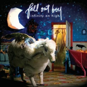
Fall Out Boy – Infinity On High
The flying sheep and dream-like atmosphere are this cover’s best features. The artwork has depth and gives you plenty to look at, especially the various contrasts that coexist (moon/wall and crow/wall with light and dark values, closet interior/wall with temperature values). The artwork just has a unique dream feel.
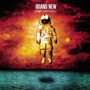
Brand New – Deja Entendu
I have no idea why the astronaut is there, but this cover just looks, to put it simply, cool. Contrasting temperatures result in an odd feel that absolutely fits Brand New’s distinct rock sound. This feel is further expressed by the textures of the water and sky.
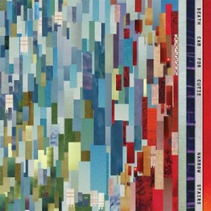
Death Cab For Cutie – Narrow Stairs
No stairs here to reflect the album title, but the cover looks fantastic nonetheless. The multi-hued red, green and blue colored strips of paper being layered have great visual texture and the fact that no two strips share the same tone (more or less) gives this cover a lot of interest.
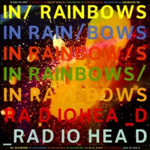
Radiohead – In Rainbows
This pop art styled cover designed by Stanley Donwood, who has done every Radiohead artwork since 1994, looks like something created digitally when in fact it (surprisingly) isn’t. It features a galaxy photograph layered with paint and interesting type that looks simple and fits Radiohead’s style of experimental music. The variety of color also serves to reflect the album title itself.
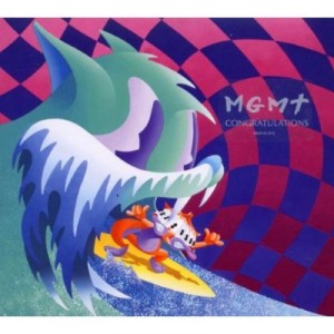
MGMT – Congratulations
‘Psychedelic’ just about sums up this cover. Odd colors, an i-don’t-know-what’s-going-on scene, and the cartoony style makes the cover seem like it’s something you’d see in a weird dream or trip (drugs are bad for you, kids).
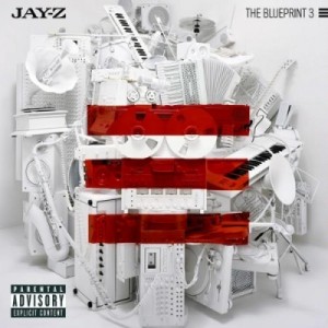
Jay-Z – The Blueprint 3
Clean cover, with something other than the generic rapper’s face or body photograph. From a distance, the red bars have strong dominance and clearly indicate the cover is of the 3rd installation of Jay-Z’s ‘Blueprint’ records. Closer up you notice the objects piled up which adds complexity and depth.
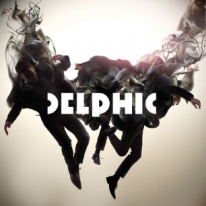
Delphic – Acolyte
The artwork is absolutely amazing. Great photo-manipulation of the band members and the smoke they fade into. It’s something you definitely won’t mind looking at on your ipod.The background may be a tad simple when the complex photomanip is placed on top, but the Delphic typeface works to ease the combination.
Jimmy Eat World – Chase This Light
Beautiful photograph with vibrant colors, giving insight to what the music itself is like. Nothing really much to say, just a wonderful looking cover.
The Killers – Hot Fuss
Smoooth. A soft blue dominates the cover (plus hints of red), and gives off a fuzzy, mellow feel. The Killers’ logo typeface fits well too, although I’m not sure I can say the same for the buildings lining the bottom…
Kanye West – Graduation
The cartoon style of this artwork by Takashi Murakami is great and the colors are extremely eye-catching. The illustration features West in a teddy-bear form (known as “Dropout Bear”, referencing an earlier record) being shot out of a colorful, vectorized who-knows-what. This is one creative rap album cover that sets it apart from nearly every other.
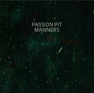
Passion Pit – Manners
Green paint, white text. What else do you really need?
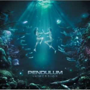
Pendulum – Immersion
The feel of this cover is great. This artwork by Polish artist Valp is mysterious and just seems to fit the sound of Immersion. The colors are great, using a majority of cool green and blue while adding hints of warmer purple and red to increase interest. There is just so much going on here that some may not notice all the subtle elements of the art from a quick glance or from their music player screens.




Connect